Back to all projects
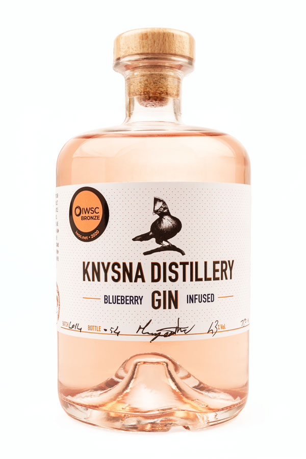
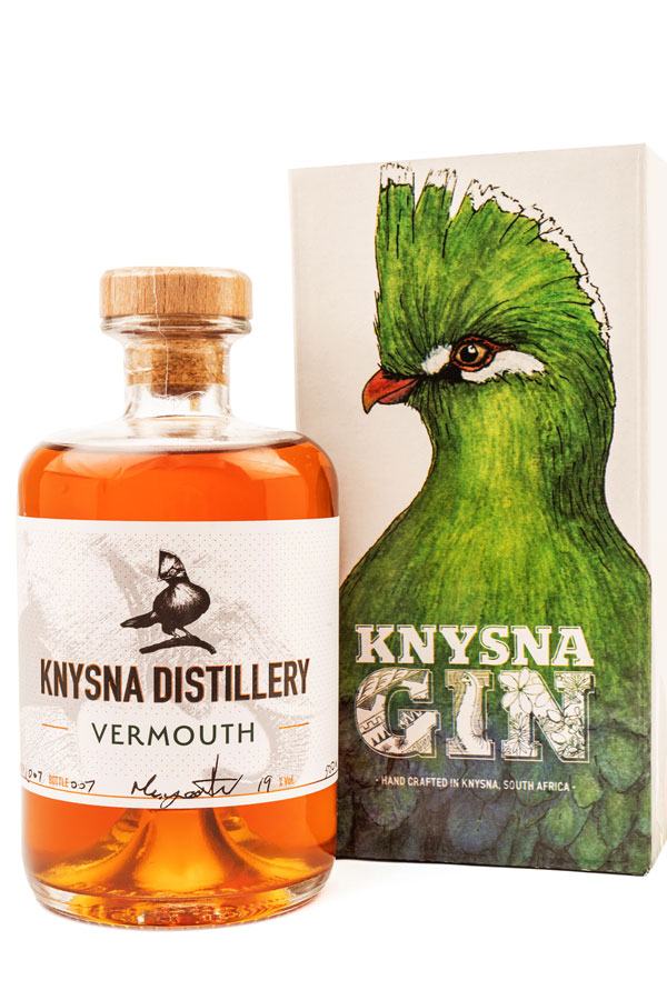
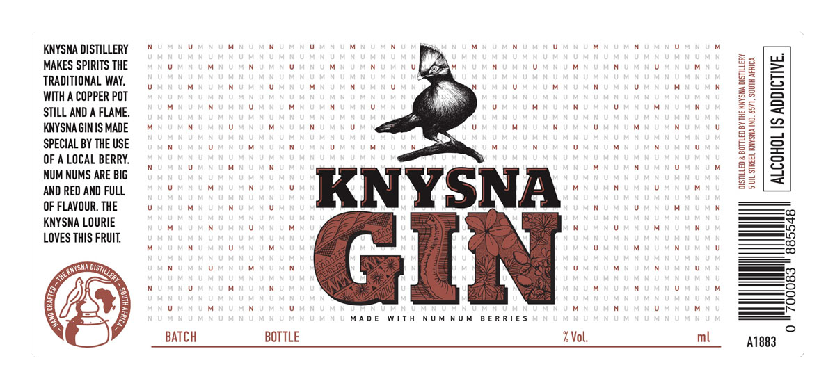
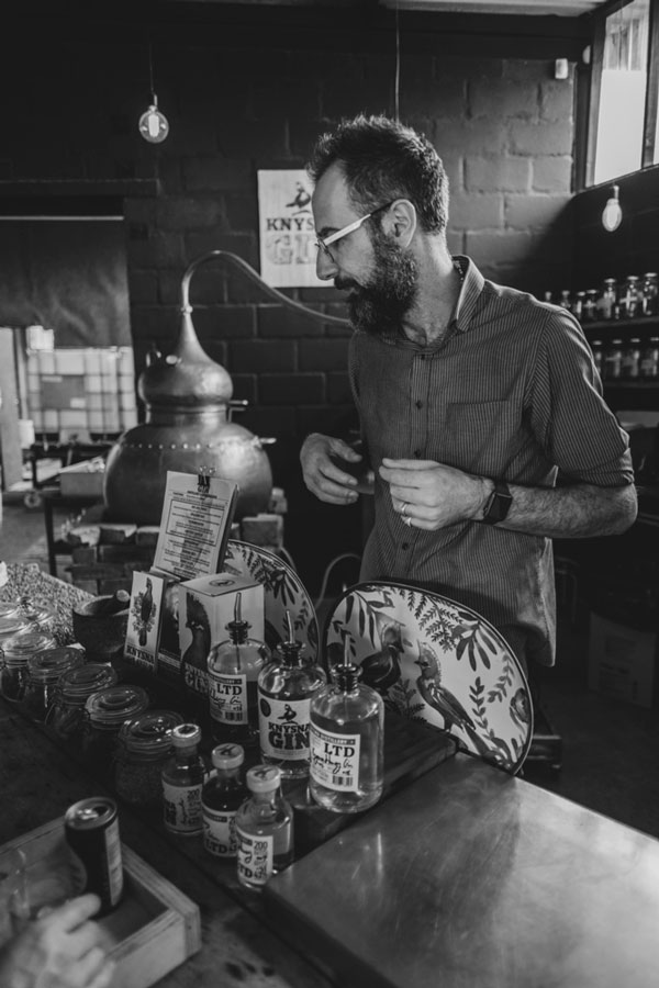
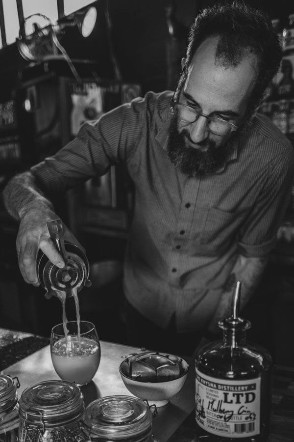
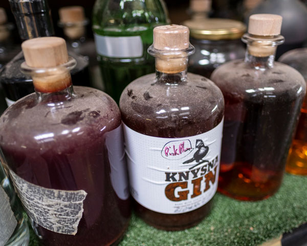
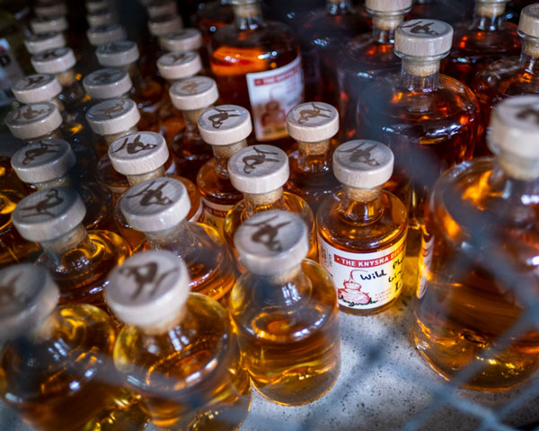
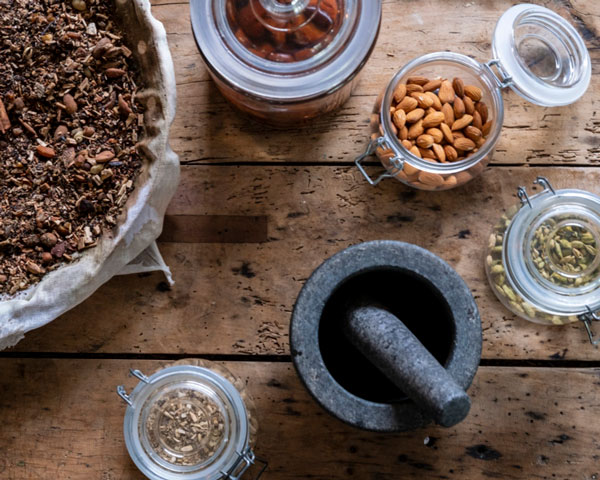
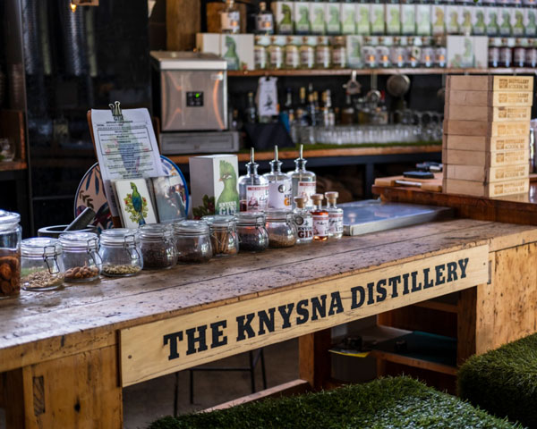
This is an identity design for a local gin crafter who wanted a handmade brand feel. Our solution: just like the ingredients - the design elements needed to be locally sourced too.
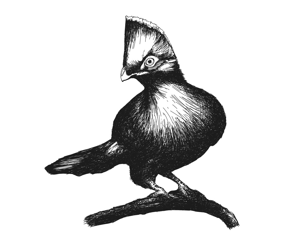
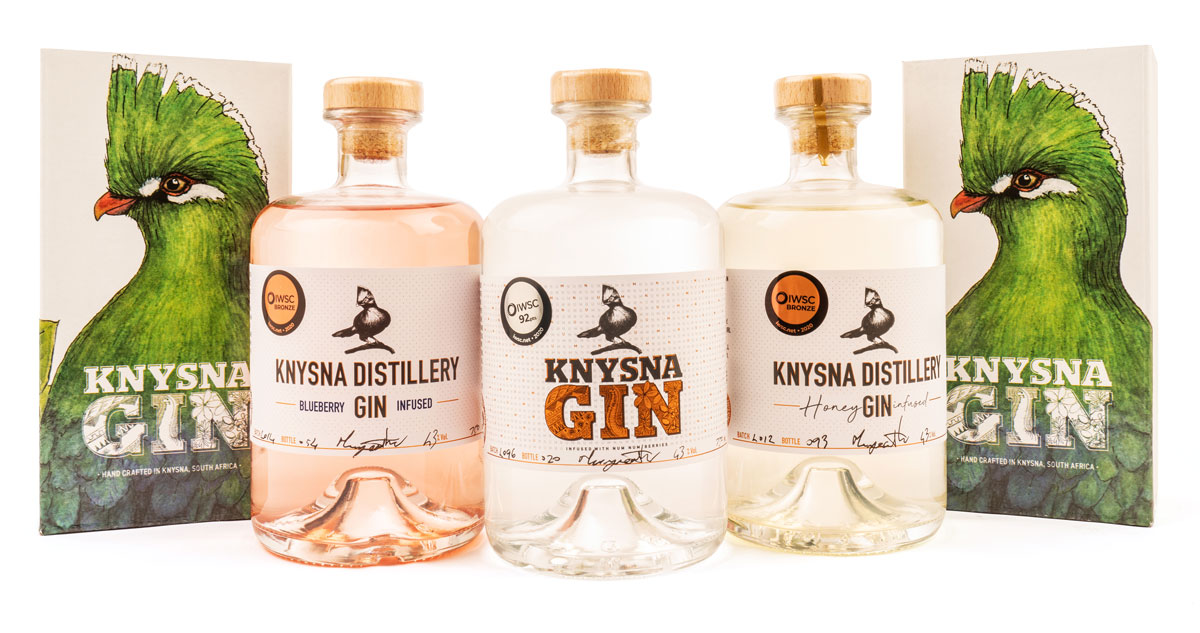
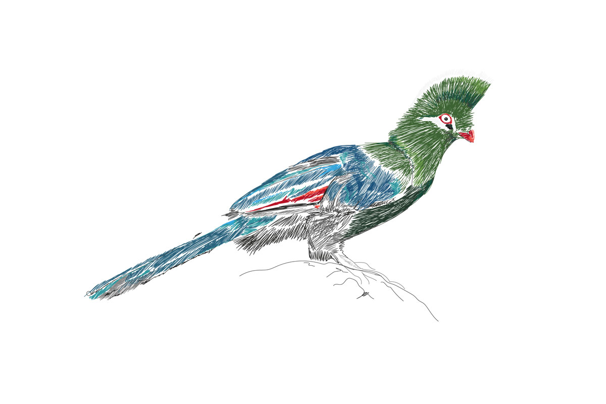
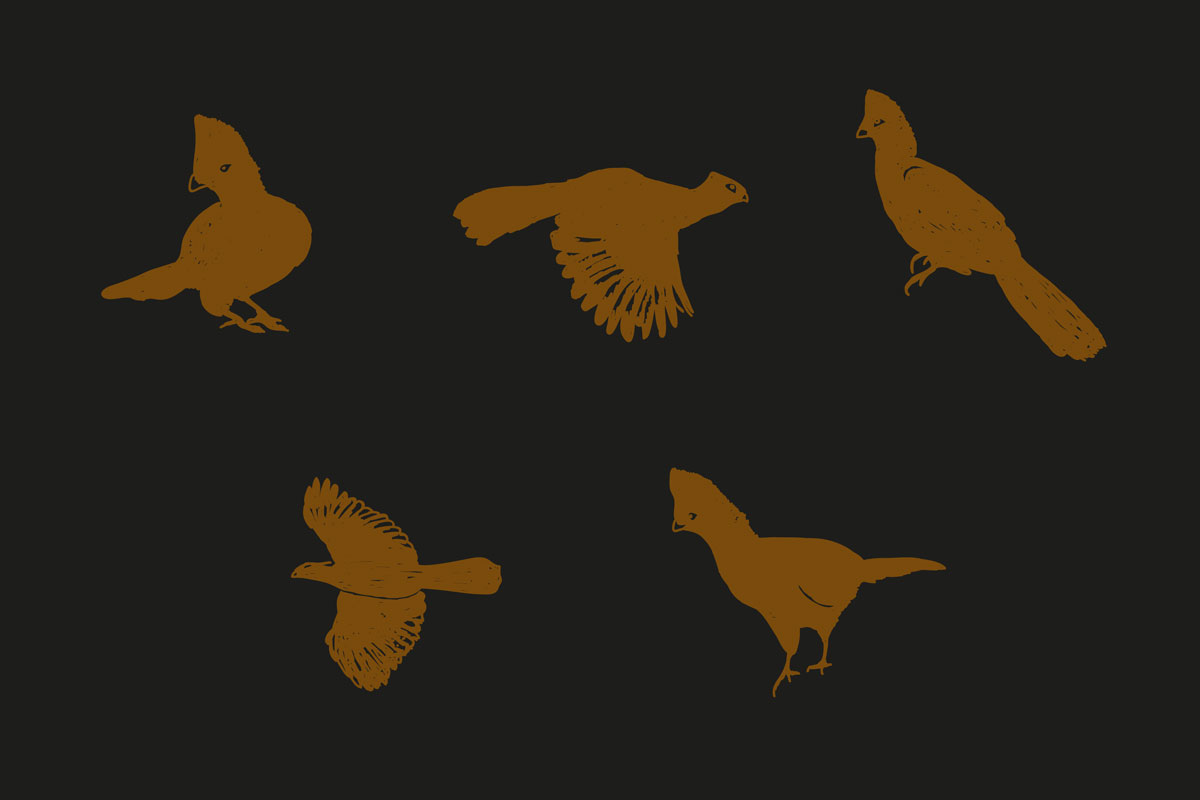
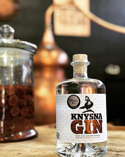
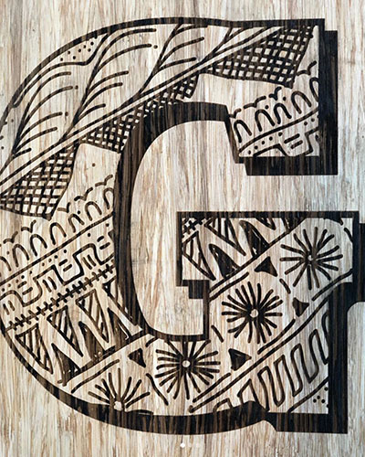
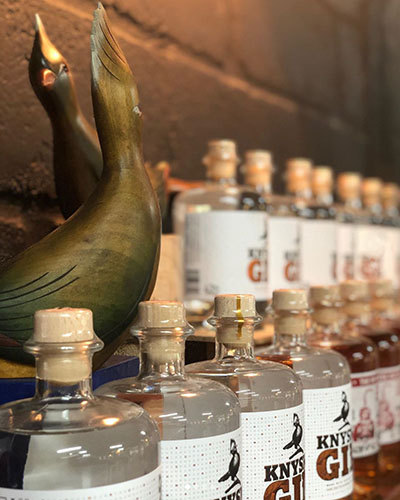
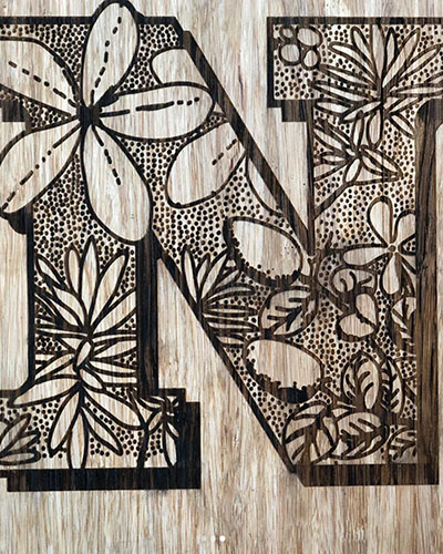
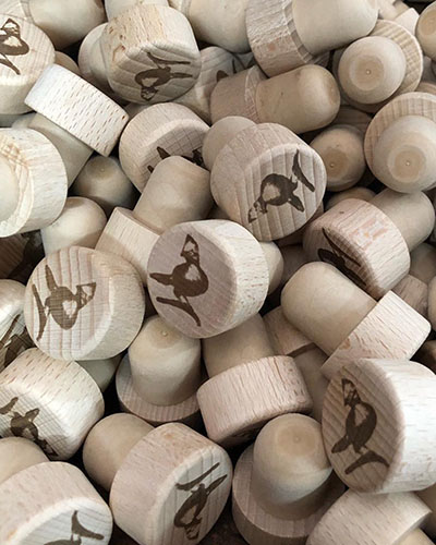
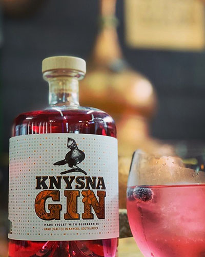
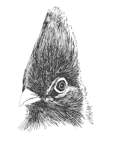
While the lourie provides the main personality, our other design choices also had clear reasoning behind them. The bottle has a medicine shape because of gin's medicinal origins, the hand drawn patterns depict african shapes and botanicals. Even the bronze foiling on the label connects to the copper still in which it's made. Broadly still, we used acid-free papers to print on, and wood signage for burning the logo rather printing.